


S T E R A N K O
And The Case of the Missing Op Art (Redux)

Before I get into a little mystery surrounding a certain comic strip panel in Captain America #111 - March, 1969, I’m going to add a few pieces of Jim Steranko’s incredible art, plus his graphics from my FOOM collection.
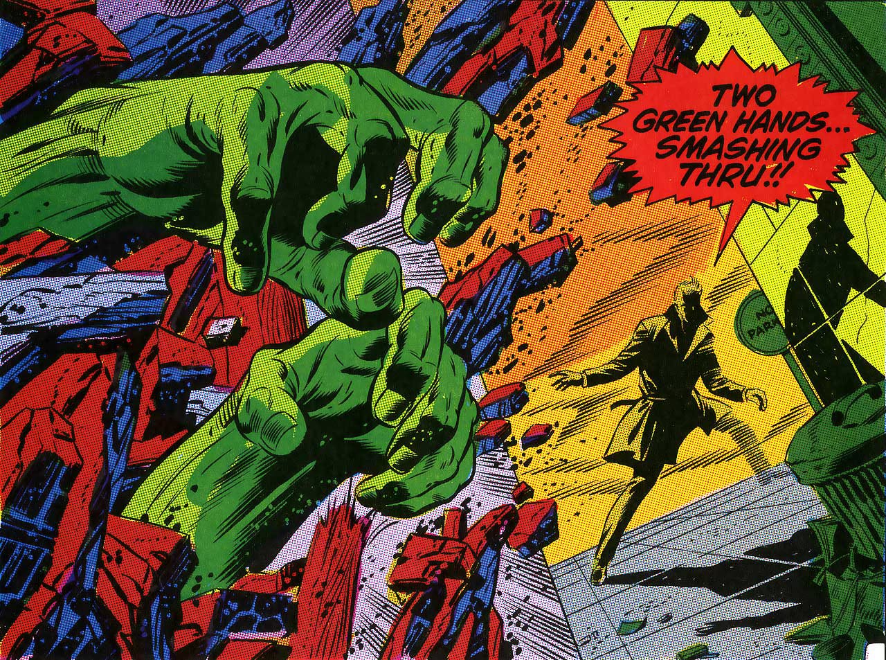
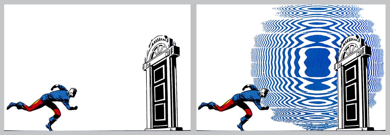
I mean, just how freakin’ powerful is this one panel!
Captain America #110 - Feb, 1969.
This one was shamelessly acquired from my good friend, DJ Food's amazing long-running blog.
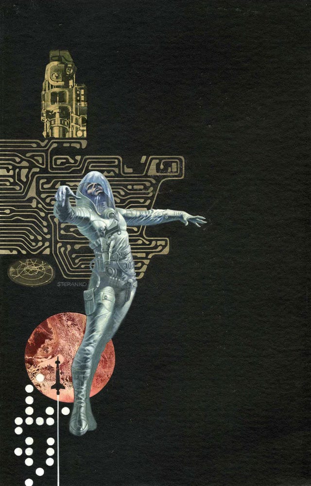
Infinity One, Paperback Cover Original Art, 1970, by Steranko - who else!
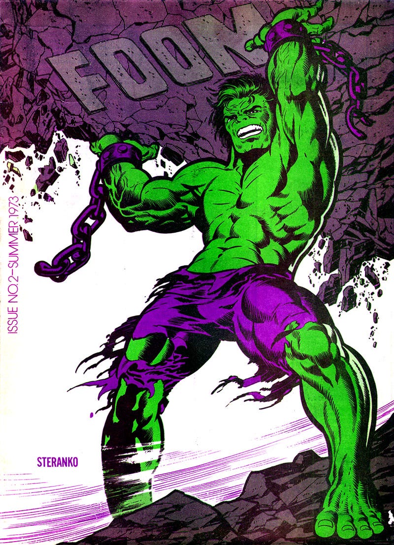
Steranko = FOOM
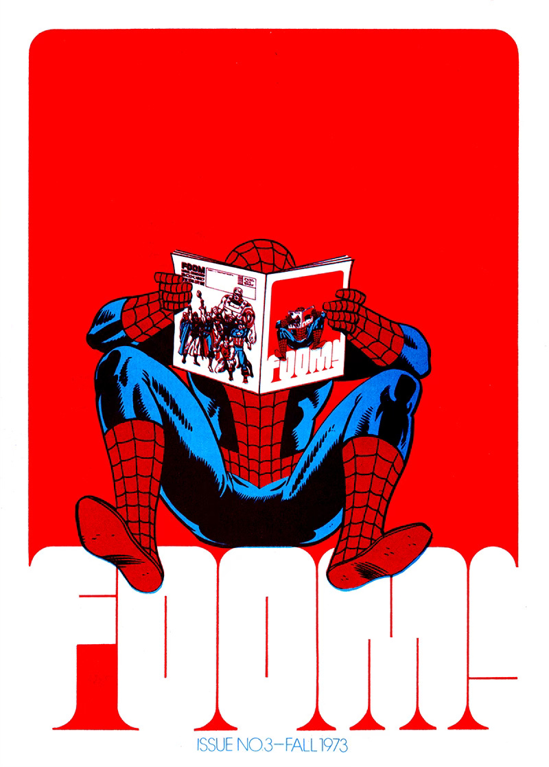
One fine day I was perusing my treasured FOOM magazines that I’ve had since I was a teenager, and admiring just how beautifully well designed they were. I began to wonder who the designer was, and suddenly it dawned on me. Steranko did 'em! It all makes total sense. Inside he's credited as editor, but nothing else. A quick look on Wikipedia confirmed my suspicion. I’m so very glad I have these.
Fee-fi-fo-FOOM

These covers are all from my collection.
And on the back…
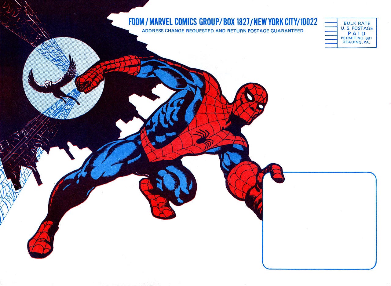
It seems to me that the art and design for FOOM was a real labour of love, and I’ve never seen a Spider-Man that looks quite like this!
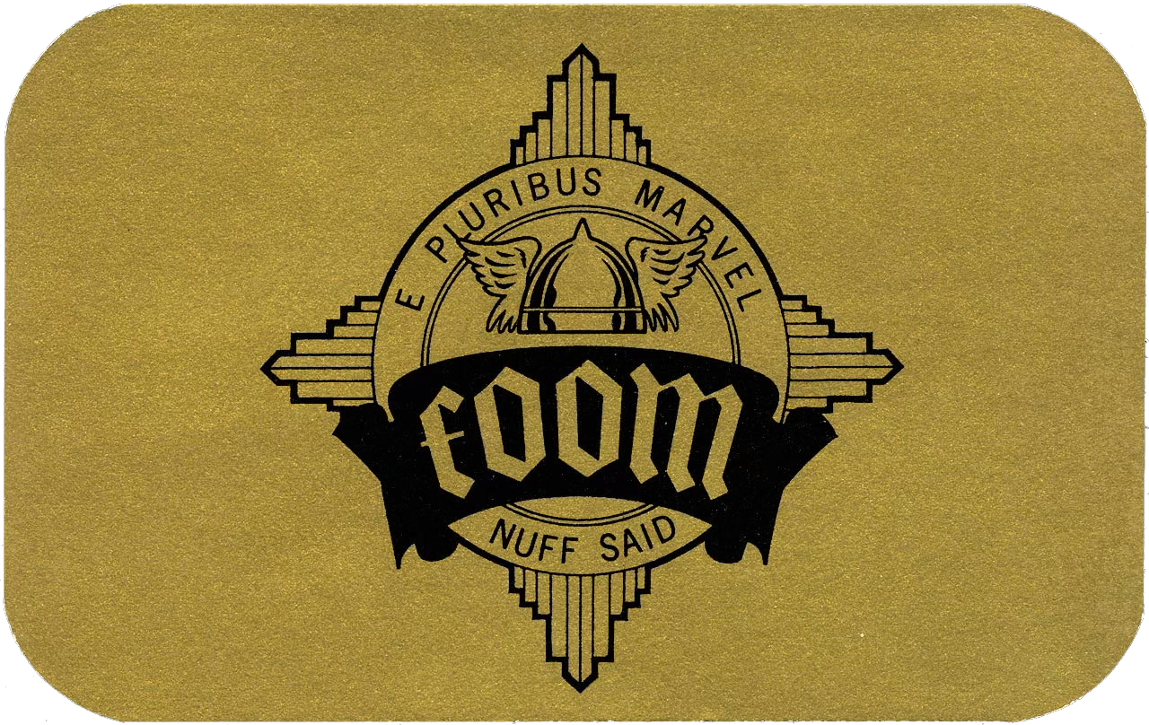
Even the beautifully well designed membership card. What a class act!
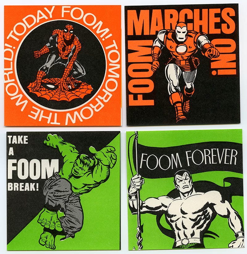
And the graphics on these non-sticky stickers!
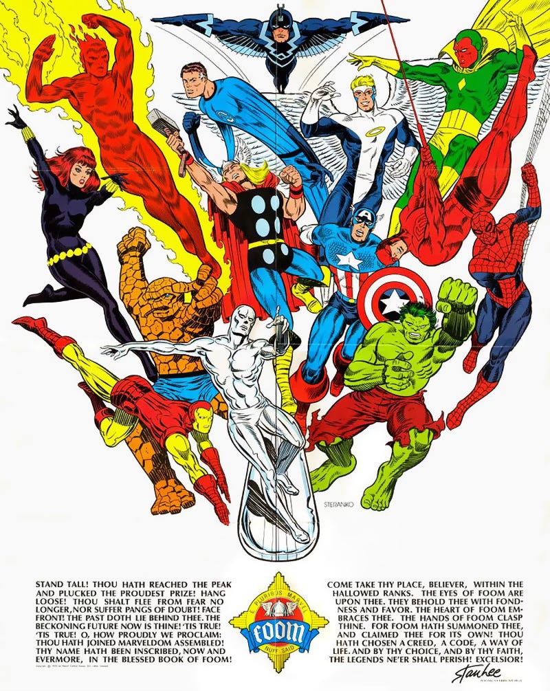
Let’s not forget this incredible FOOM poster. I’m lucky enough to still have mine in pristine condition despite having had it on my bedroom wall for a good many years.
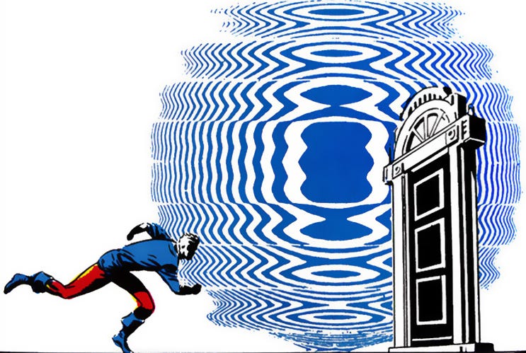
Captain America #111 - March, 1969 "Tomorrow You Live, Tonight I Die!!"
Script: Stan Lee. Pencils: Jim Steranko. Inks: Joe Sinnott.
Right… Now for the little mystery I mentioned earlier.
Back in 2012, I posted the above image on my Secret Oranges blog as one of my ‘Largin’ it’ series, where attention is paid to one particularly splendid comic book panel. After doing so I had an interesting message from Tony Robertson, who runs The Drawings of Steranko website.
Tony Robertson - 26 March 2012 at 14:27
In the original American edition that blue FX was not present. I always wondered if they made a mistake in the US edition by leaving it out, or someone in the UK got creative :).
Tony then took it upon himself to get right to the source and contact Jim Steranko about it. This was Jim's reply.
"The psychotropic Dream Sequence in CAP 111 showcased several surreal special FX, including the optical shockwave behind Bucky on the second page. The color effect was achieved by means of an overlay on which the effect appeared. (The clouds on the previous page, for example, were suggested on my color guides.) Marvel press prep dropped the ball and printed the page without it; Marvel UK got it correct. Since the UK operation was only given film, rather than originals, with which to work, how they achieved the effect is a mystery--one of many regarding my material."
So there you have it! Jim Steranko explains all.
But it didn’t end there. Five months later, Rob Kirby, who is currently writing his book From Cents to Pence, charting the history of Marvel UK, left a message too.
Rob Kirby - 3 August 2012 at 23:54
Ah, well as longtime admirer of Jim's work, I'm happy to be able to clear up the mystery as to how Marvel UK got it right in this instance, and perhaps if Tony sees this he can pass it on to Jim! You see, Marvel UK weren't using film supplied to them. Jim's probably forgetting after all this time that between 1972 and 1979 the early British Marvel comics (which was only a fan nick-name anyway - strictly speaking they were Marvel International, as Marvel UK not being coined until into the 1980s) were actually put together in the States. Let me explain, briefly...
In the 1950s Marvel formed a relationship with Transworld Feature Syndicate based in New York. They supplied film to any publisher who wanted to license Marvel strips for use in their comics, so they were supplying film all over the world, and in England to publishers such as Alan Class and Odhams (simultaneously - they had no exclusivity in any of their UK dealings until Dez's era).
For various reasons far too involved to go into here Marvel decided they wanted to produce their own comics for the UK market so they could do them the way they thought they should be done - i.e. not diluted by non-Marvel material as in Odhams' line of Power Comics and latterly as in TV21 Mk.II.
And because Marvel wanted complete control, it made sense to create a UK Bullpen alongside the US one (you can see it clearly located in the Bullpen floor plan on the back of an old FOOM) - with their London office used a finishing house to add in local content: letters pages, adverts and house adverts.
The London office was based in Transworld's UK offices for convenience, and overseen by Ray Wergan, whom I've had the great pleasure to talk to over the past year, and for the first time anywhere have finally managed to get the full lowdown on how, and why, the UK line all came together! And, despite what has been speculated in the past, Stan actually played a huge part in setting up the UK operation, and it was very much his baby.
What London received then was pasted-down stats (not film at all) for an almost complete comic, along with stats for the mainly new front covers and any new poster artwork - although the UK office would commission a few pieces when comics under-ran by a page, and that certainly did happen!
And so, in short, this is how Marvel UK got Jim's artwork correctly printed in B&W. Whoever made the stat for that issue of Super Spider-Man and the Titans remembered to flap down the overlay. Mind you, this didn't always happen, of course, and I'd spotted other examples of stories that appeared more than once in the UK comics where one story had the overlay and another didn't. You can't win 'em all, I guess :-)
Sorry, I've only just been made aware of this snazzy blog, so I hope that (belatedly) clears this one up, anyway ;-)

Rob
More FOOM stuff here…

So, Voila! I hope that solves that little mystery. Here are the links for Tony Robertson’s The Drawings of Steranko website, and John Freeman’s wonderful Down The Tubes website where you can read all about Rob Kirby’s forthcoming From Cents to Pence book.
Great bit of history. Thanks for sharing!
Cheers for the behind-the-scenes Steranko Special, Sleuthing Steve. I remain a fan after all these years and that's the only FOOM issue I've kept. His interpretation of "Repent Harlequin", said the Ticktockman – 3D glasses and all – in The Illustrated Harlan Ellison remains one of my all time fave comic book adaptations (along with Archie Goodwin and Walt Simonson's Alien and the recent The Road by Manu Larcent), even tho' my copy of the Byron Preiss book is seriously falling apart.