New Statesmen
Scalpels and rOtring pens
Going Dotty!
It was 1989 and having already designed the New Statesmen pages for the fortnightly CRISIS comic a year earlier, the deadline for the American Fleetway/Quality series was now looming, and I had to start designing the books and illustrate the extra pages that the editor, Steve MacManus had commissioned.
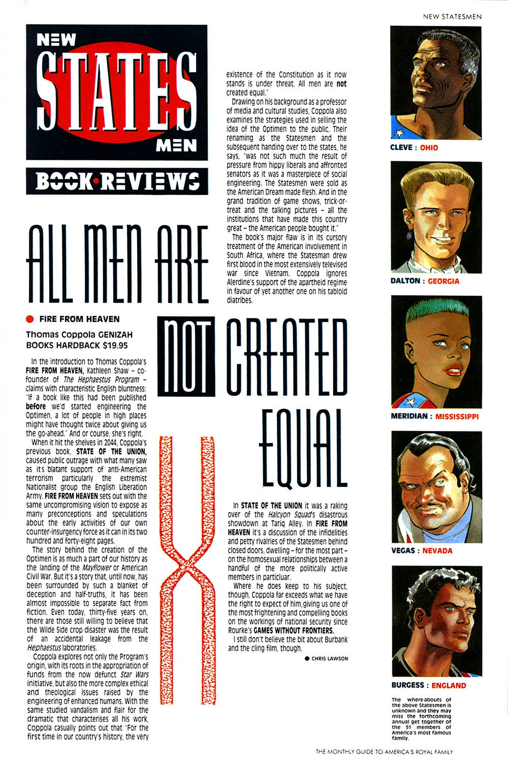
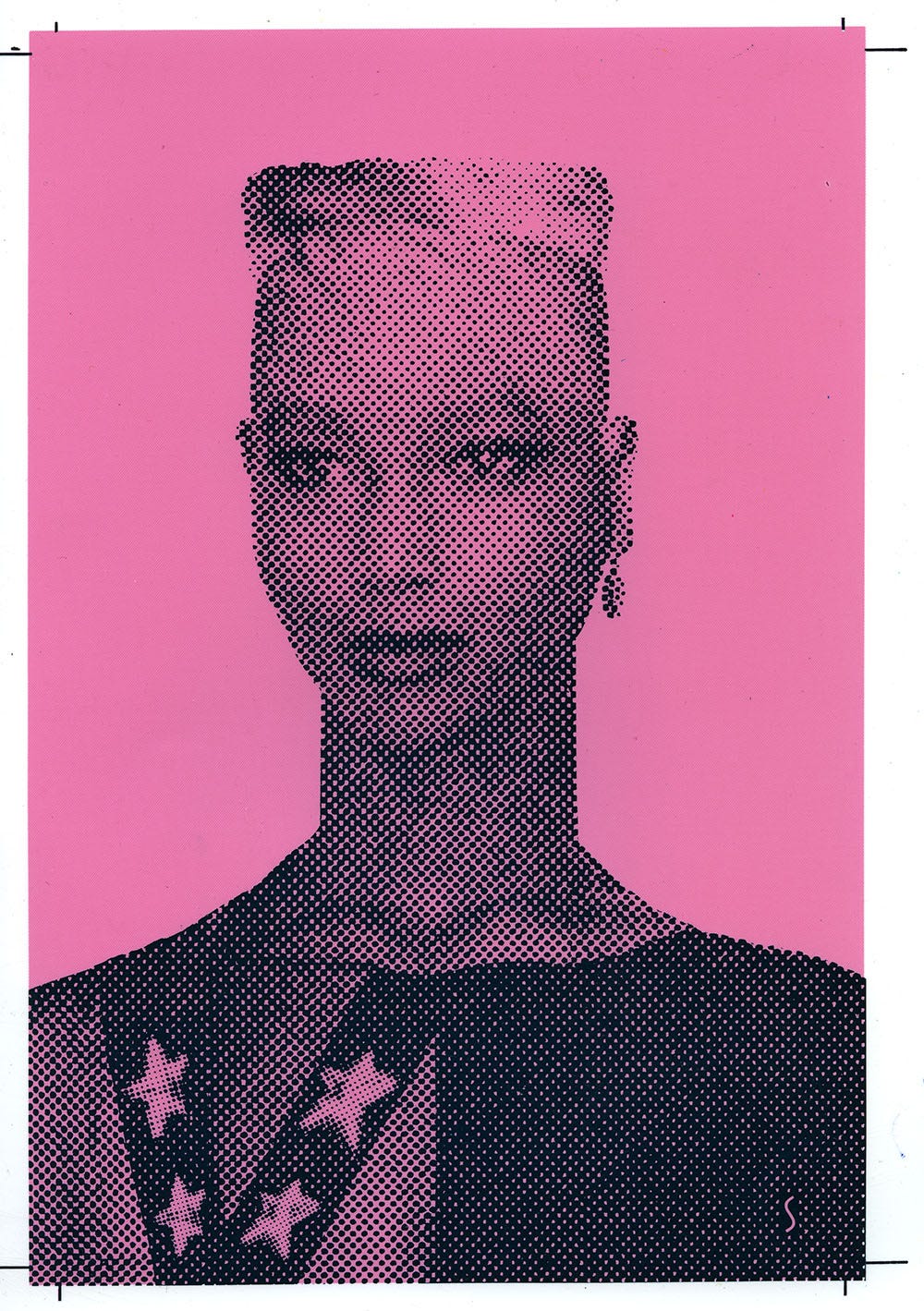
I had a fascination with how Jim Baikie had portrayed the Meridian character and thought it would be an interesting experiment to try and find a model who actually looked like her to photograph for the first of the extra pages. Knowing the time constraints and budget, etc; it wasn't really a very practical idea, then with one of those coincidental events that always seem to happen at the right time, I spotted a small photo of just such a person on a piece of discarded newspaper.
What seemed to be a real artistic challenge at that moment in time, turned into complete h:a:l:f:t:o:n:e: madness when I decided to enlarge the part of her face that looked like Meridian with the pmt (photo mechanical transfer) machine, then recreate the rest of her with hand drawn halftone dots of various size and spacing. The plan was to reduce her back down to the size of the original clipping once I'd completed the task, so that she once again looked like an actual photograph.
I think I nearly lost either my mind or my eyesight that night with the continuous squinting and deliberate blurring of my vision to see how big or small the new dots had to be. Once I'd started I just couldn't stop, and I believe it was at least four o'clock in the morning when I finally decided that although it wasn't perfect, I just had to let it go and call it finished. As it turned out, I decided to leave it full size, because it looked kind of abstract. I know that I could manipulate an image like this so much better and ten times faster using Photoshop or Illustrator these days, but this was still the analog era and the only digits involved were my aching fingers.
Justified and Ancient
Another forgotten file and inside, loads of items relating to Fleetway's New Statesmen series, written by John Smith. I also found pages and pages of typewritten text that I'd marked up, ready to fax or send by courier to the typesetters.
Type mark-ups are destined to become yet another ancient art, now that computers are forever in our midst. It's easy to forget how long the design of a page used to take before desktop publishing.
The writer would either mail or fax their script to the editor, who in this case was Steve MacManus. He would check everything through, making any editorial changes or suggestions if they were needed. This was then given to me to figure out what type style, size and leading would be needed for the page layout. Whether it would be ranged left, right, justified, indented, etc, etc. I would mark it up like this (above) and then it would be faxed over to the typesetters.
Before I could properly start on the page paste-up itself, I would be waiting for the text proofs to arrive by motorbike courier. Heaven forbid if I'd marked something up wrongly or the typesetters had mis-typed something! If this was the case, the whole process would start over and I'd have to wait for the next bike delivery, which depending on the typehouse and courier's workload could easily be the following day. It's incredible how quickly this all became superceded by the digital process.
I particularly remember the page mark-up above, because this was for the first of the American format editions of the series. Steve MacManus had asked me to design the title pages and had given me free rein to illustrate them myself, which was an exciting prospect.
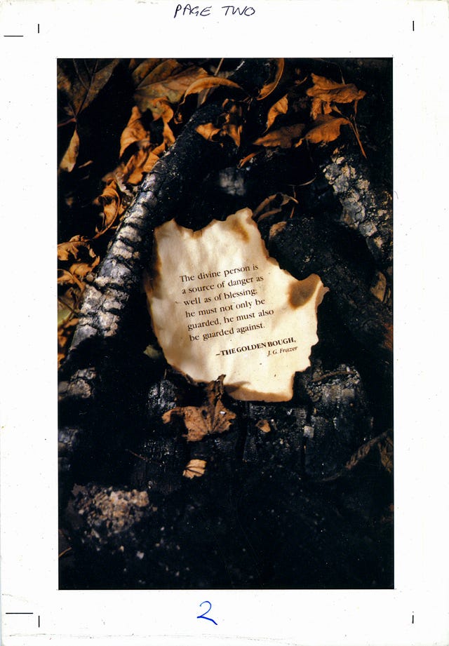
For inspiration I had this sheet of text alongside John Smith and artist Jim Baikie's prologue to the story, which began in a refugee camp site in a forest. With this in mind and knowing that Alan McKenzie had celebrated November the 5th with a bonfire in his back garden the night before. I dropped by his house and asked if I could scoop up some of the charred remains to take back with me. Having done this, I rearranged it in my studio (AKA living room), and photographed it using the light from my tungsten photo lamps. I had the typesetting for the Golden Bough quote, so I set fire to this and managed to put it out before it all went up in flames. The finished page proof is below.
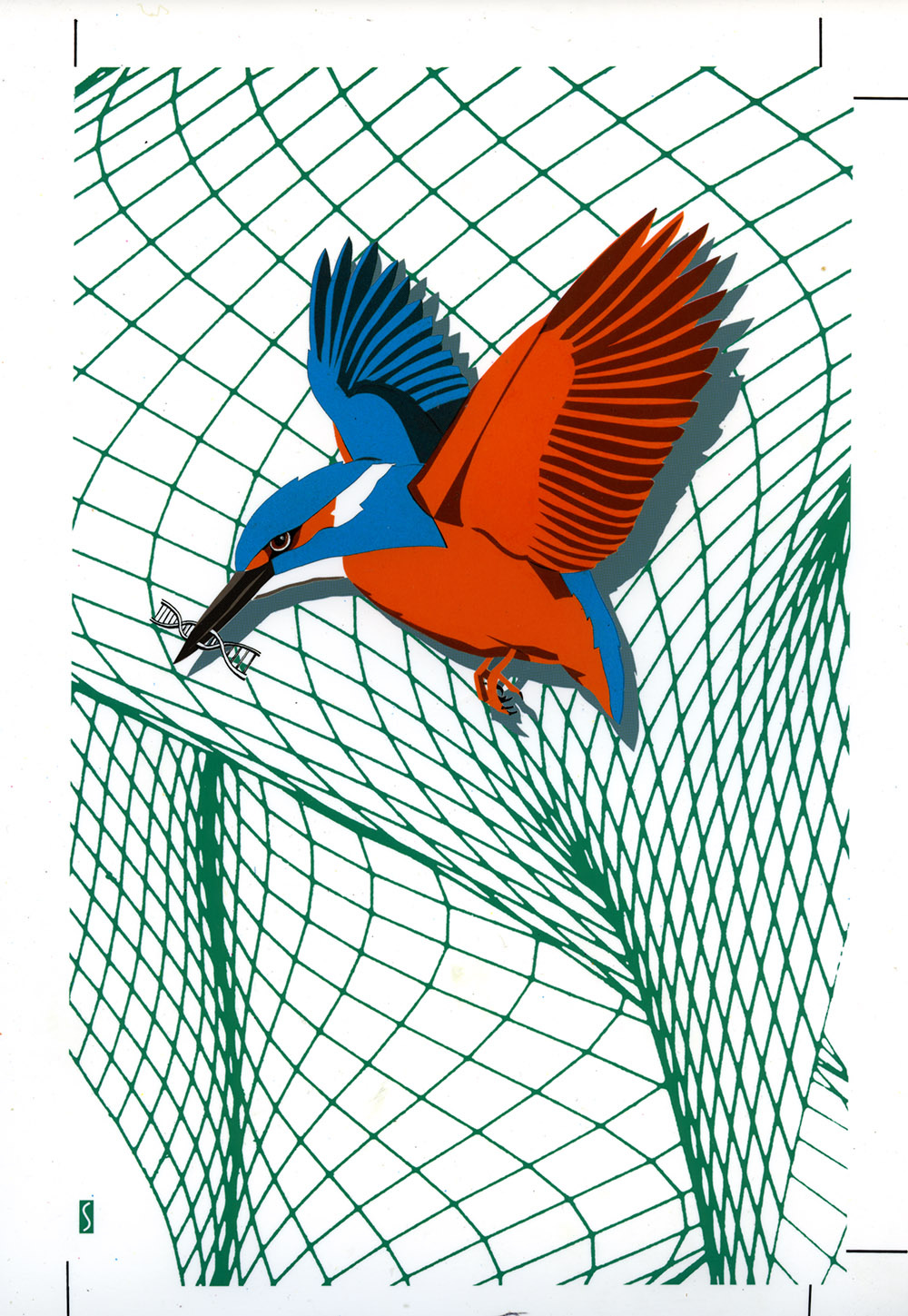
Another of these design pages involved me trying to emulate something that was illustrated using a computer, though owning an actual computer didn’t happen for another three years, so I instead made use of a scalpel, coloured Pantone film and a rOtring pen.
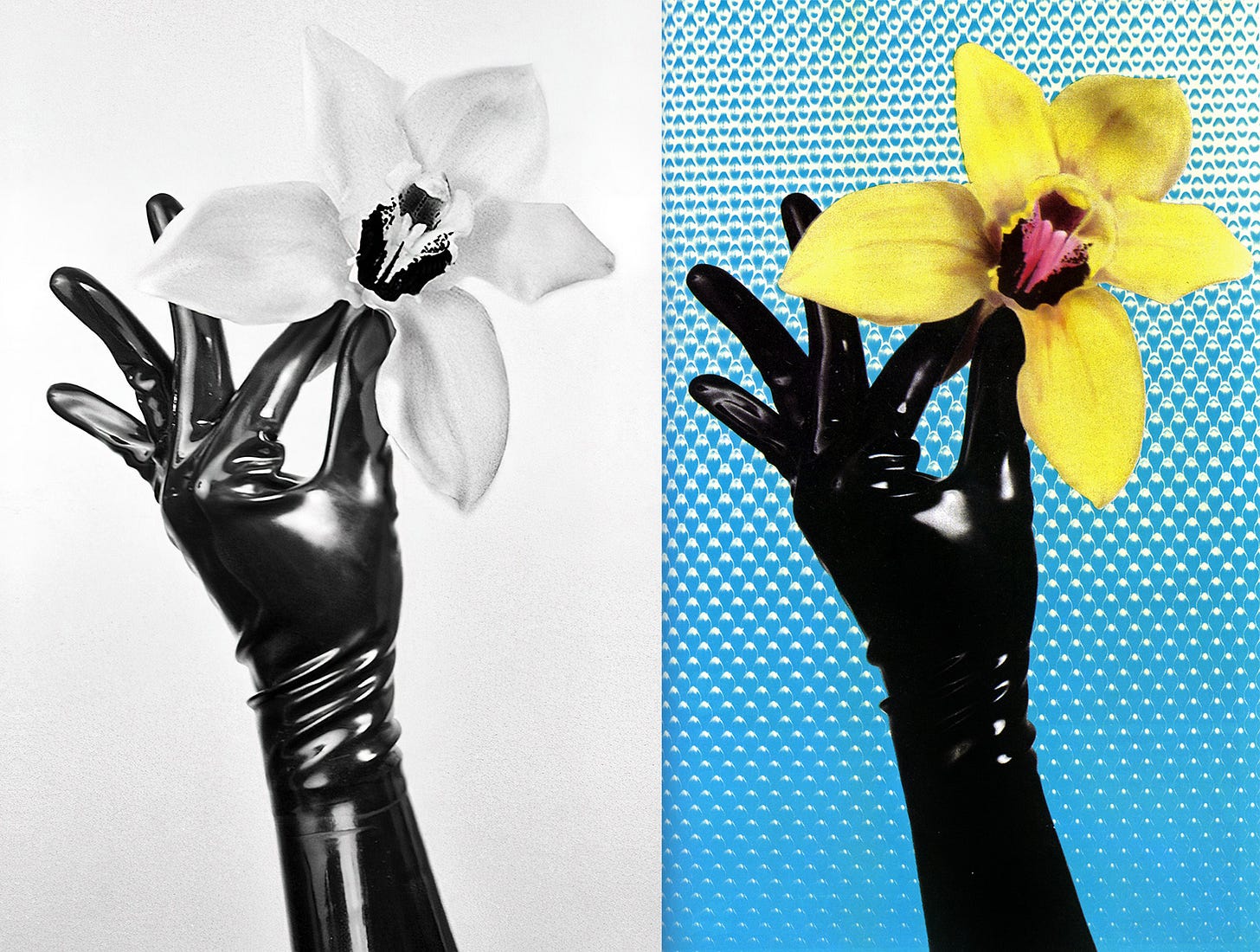
For another pre-computer montage, I shot the gloved hand and flower, colored the print using photographic inks, then carefully cut it out using a scalpel, and superimposed it onto a photo of the interior of the elevator from the East End flats where I lived. I honestly can’t remember what the significance was, but I enjoyed making it, anyhow.
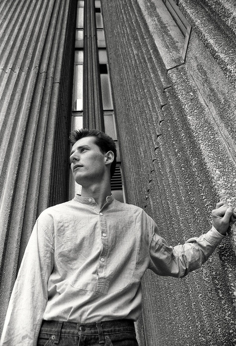
To wrap this up, here’s a photo I took of Steve MacManus, the 2000 AD Editor in Chief, in his office AKA the Nerve Centre at Fleetway in 1988.





https://www.icloud.com/iclouddrive/0b5Pucgpv_a7x5bLGvv3TbKHA#NewStatesmenSC_199X
I bought my copy of New Statesmen back in 1992 (or thereabouts) not having ANY idea who this Cook bloke was! I was so impressed by the design work, as much as I was disturbed by the story it embellished. Little did I know that 25 years later I’d be working alongside the fellow, designing the best-looking graphic novel (read: comics) collections in the business! Such a small universe, ain’t it?
Fascinating as always, Steve.