Inspired by all the wonderful TV21 covers I grew up with in the 1960s, this was my own take on a tabloid style cover, and one of the last Starburst magazines that I designed for Marvel UK in September 1985. The cover text was by the editor, Cefn Ridout who I worked with on Manga Mania a few years down the line. I've always been pleased at the longevity of the Starburst logo. It survived the transition to the new publishers and an updated version of it is still in use today. It's interesting to note that in those pre-computer days, Richard Starkings, President & First Tiger of the now famous Comicraft lettering company was the guy I commissioned to hand-draw it from my original design sketch, and a very fine job he made of it too!
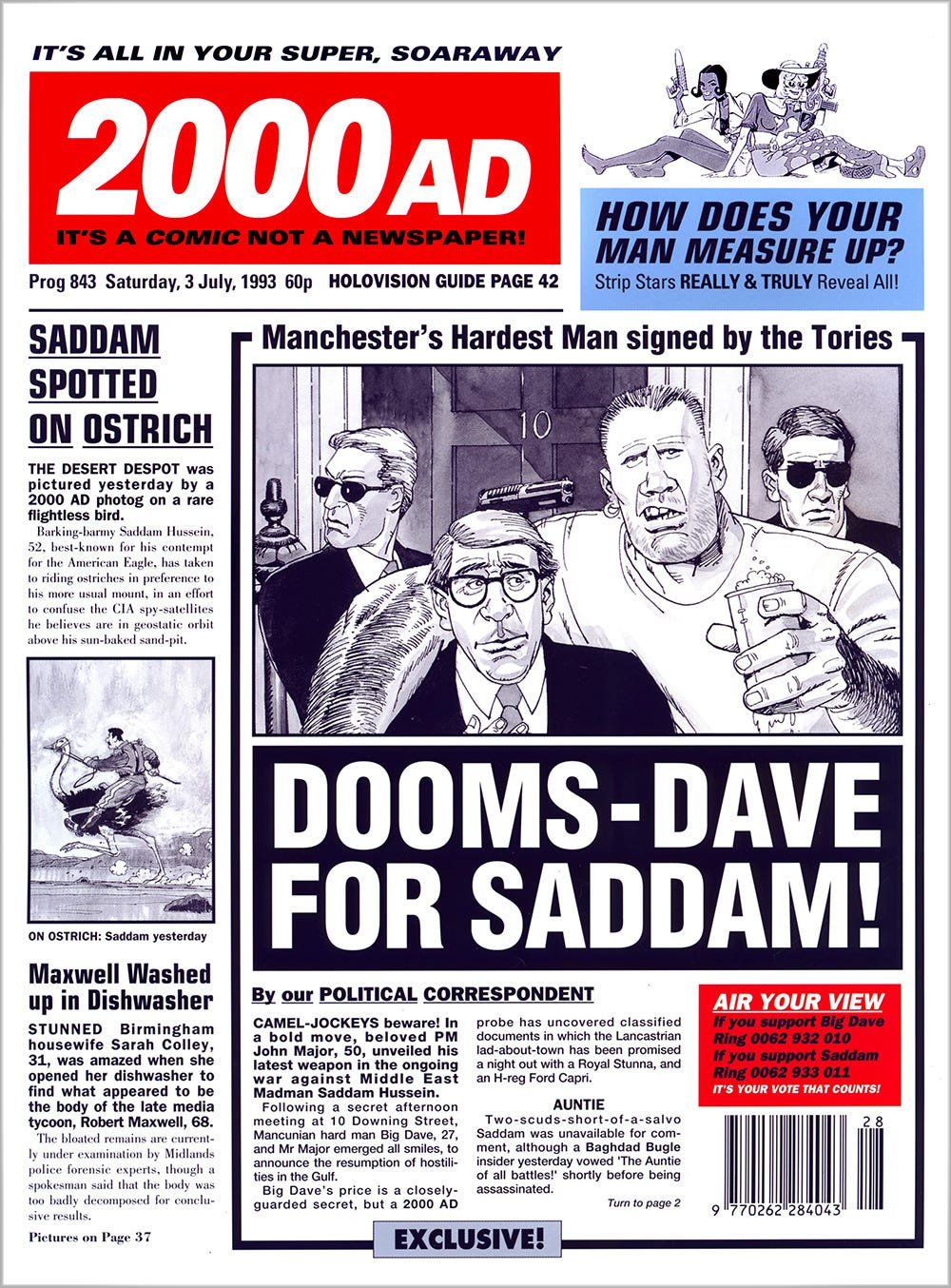
This cover was particularly enjoyable to work on. The 2000 AD crew got a bit miffed when we saw The Daily Mirror using the line It's a newspaper not a comic. So we thought we'd turn the tables on them! Alan McKenzie sat with me and wrote the headlines and text to fit as I designed it on my trusty Nerve Centre Macintosh, adding those oh, so important newspaper cliché touches. STUNNED Birmingham housewife Sarah Colley, 31, was also the name of our production manager. We had a little bit of a run-in with the Managing Director of Egmont Fleetway about changing the logo for this issue, but Jon Davidge was such a terrific MD and always supportive of our maverick ways (within reason)!
Grant Morrison and Mark Millar’s story characters were featured on the cover with superb (as always) art by Steve Parkhouse, and this rather saucy Rian Hughes illustration…
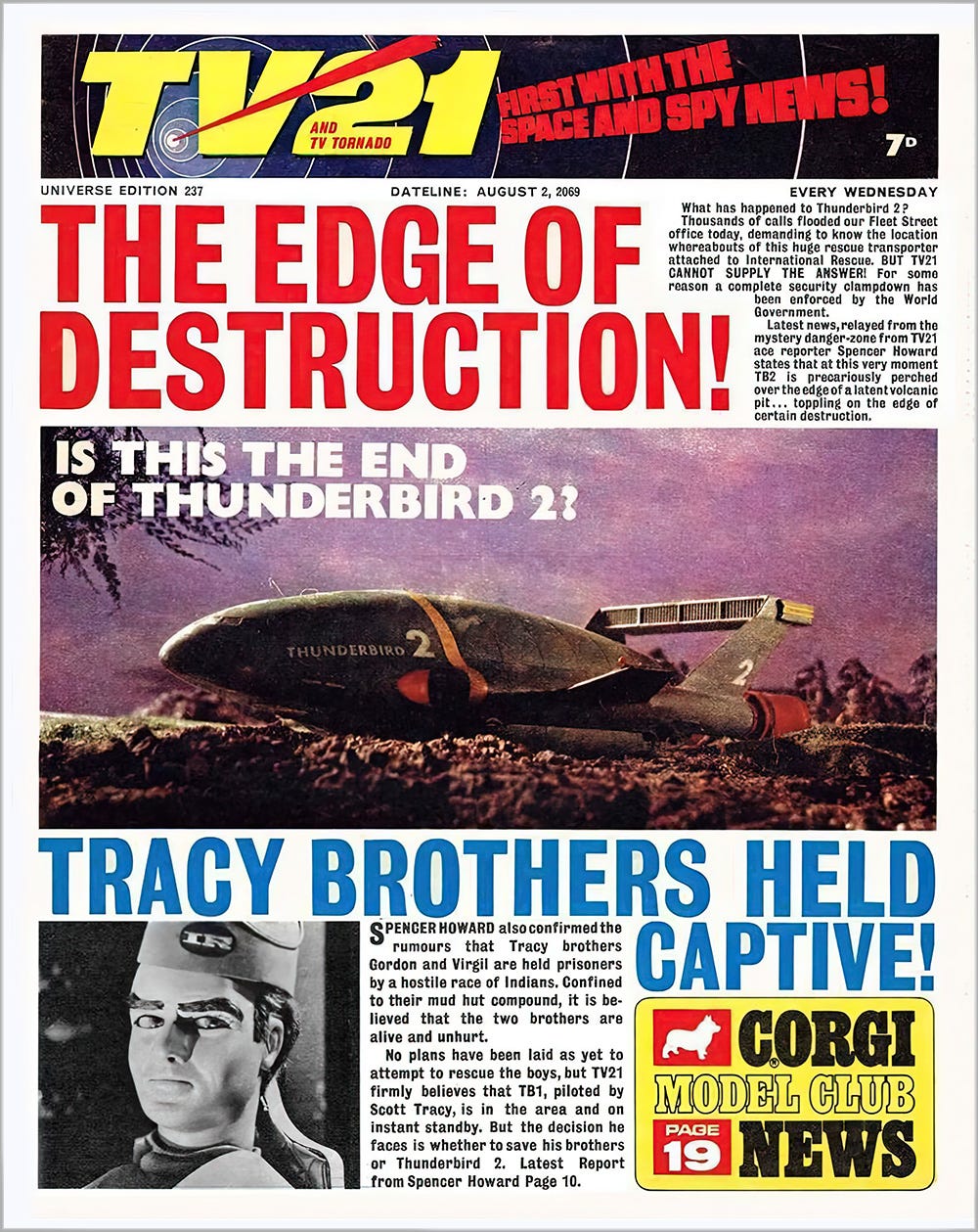
And now, back to the future and… WORLD WEATHER CHAOS! Well, it looks like we won’t have to wait until 2065. The Dateline on these comics was a genius idea, in fact the whole newspaper facsimile design was a feather in the cap for the publishers, (City Magazines/Century 21 Productions), and the brainchild of writer-editor Alan Fennell, who I had the pleasure of meeting when he was working on our floor at Egmont Fleetway in the early 90s. As a kid it really did feel like I was reading a newspaper from the future. The design was magnificent, as were quite a few comics of that era, and the comic’s masthead was inspired by the intro to Gerry Anderson’s tv shows. This also inspired my designs for the original 1999 version of the Thunderbirds movie that I’ll mention next. Meanwhile, here are two more TV21 covers from 2066 and 2069.
Thunderbirds Were Go!
Waaay back in 1998, I was asked to design the logo for the upcoming live-action film of Gerry Anderson's Thunderbirds for Working Title Films. Peter Hewitt, of Bill & Ted's Bogus Journey was the director, and the art director I was working for was Joseph Nemec III, who had famously worked as production designer on James Cameron's Terminator 2: Judgment Day. Brendan McCarthy of Mad Max: Fury Road fame (who'd recommended me for the gig) was working on the character & production designs, and the film was shaping up to be a really good (and pretty dark) interpretation. Anyway, at some point the plug got pulled on the whole operation, something to do with Hollywood buy-outs or mergers or something, and it resurfaced in 2004 as a kid-friendly film directed by Jonathan Frakes.
I recently rediscovered my (very) rough designs and I thought I'd share them on here. I'm not a fan of metallic logos to be honest, but this was the 90s and they were very much 'in vogue' at the time. For the presentation itself, I decided to create a teaser poster campaign and a logo utilizing the letters ‘IR’ for International Rescue. These were then printed out to AO size, and mounted under acetate. The whole thing was met with instant approval by Peter and Joseph which really made my day, and gave me my first taste of Hollywood. It's a real shame that their version of the Thunderbirds movie never come to light, it would have been sooo good!


