Spider-Man Comics Weekly
Another Batch
I have more ancient Spider-Man Comics Weekly issues.
What I get from these comics is the pure thrill of seeing Steve Ditko’s artwork in this raw state. It takes me right back to reading these as a 14 year old.
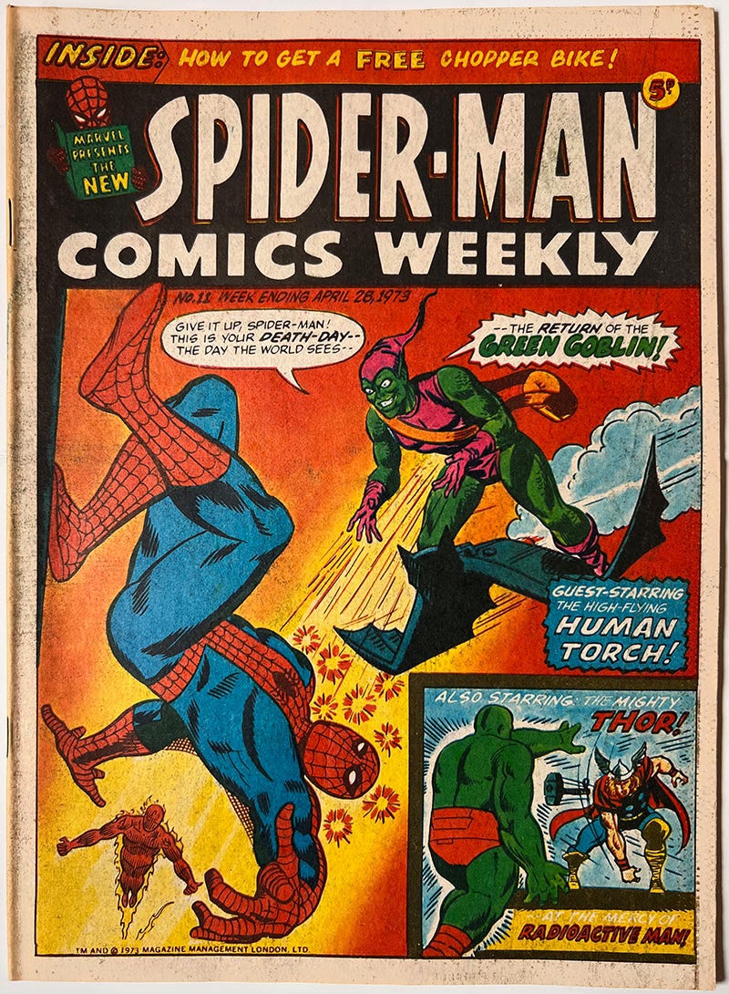
Spider-Man Comics Weekly #11, April 28, 1973 with cover art by Dick Ayers. That ‘S’ of Spider-Man is still wonky!
Lo! They finally straightened it! These have gone a bit brown around the edges, but considering how old they are, and the fact they’ve been in the shed all these years, I think they’ve done pretty well.
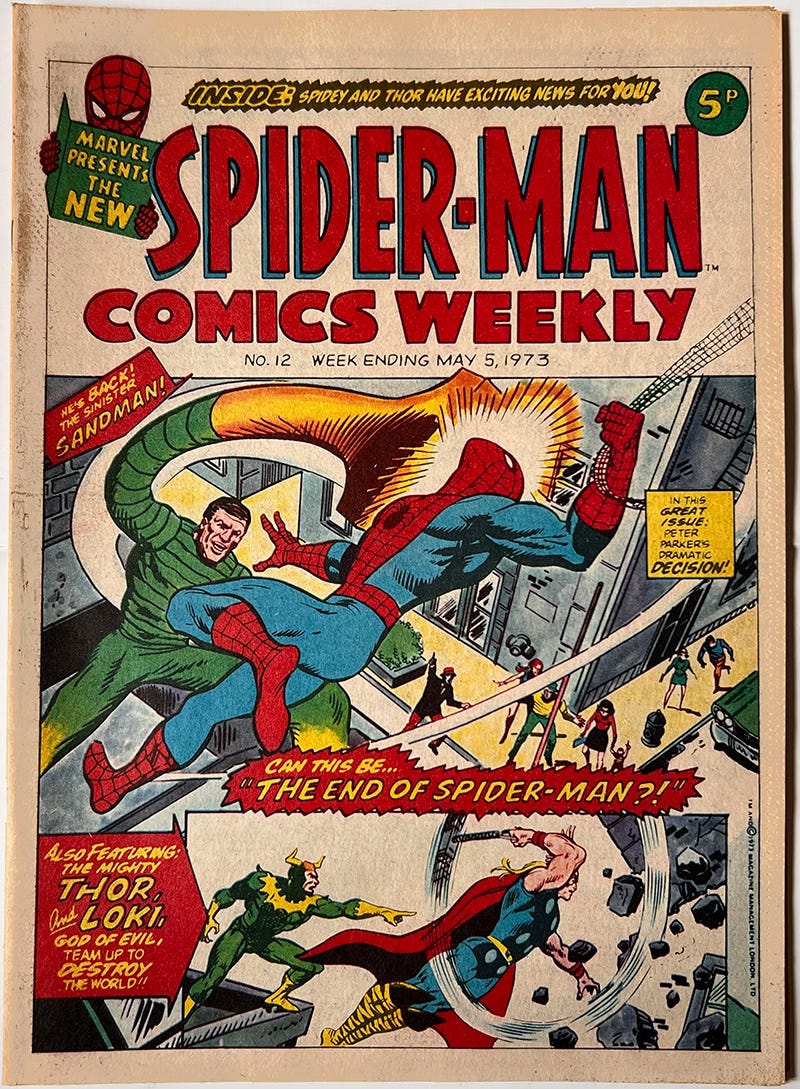
But now the ‘S’ is wonky again.
A nice back page pin-up. I always found Steve Ditko’s Green Goblin to be the most menacing of them all.
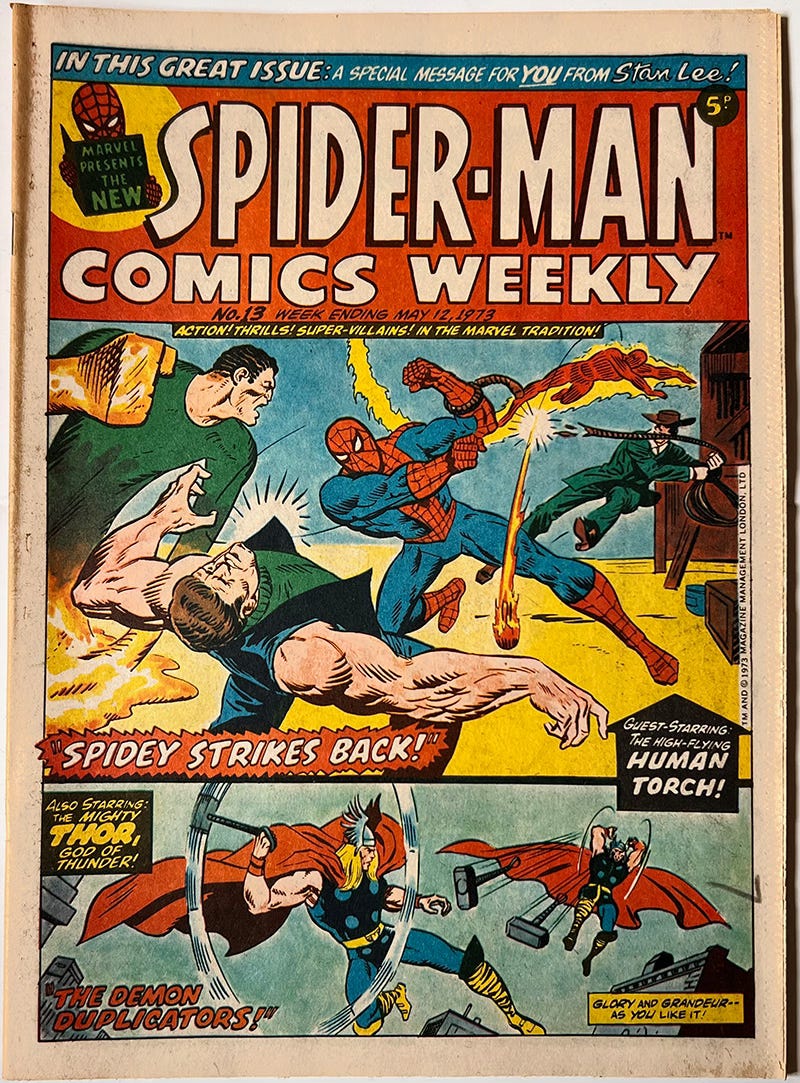
The ‘S’ is straight!
It’s amazing to think that 5 pence would buy you a comic like this. I can’t remember if it seemed expensive back then or not.
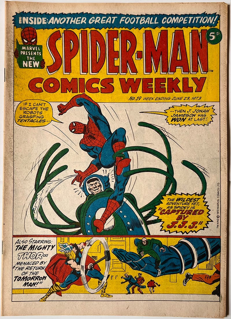
There seems to have been a slight design variation on the ‘P’ and ‘R’ of the logo for these two issues.
Ugh! Football.
‘Another Great Football Competition’ would not have enticed me in any way.
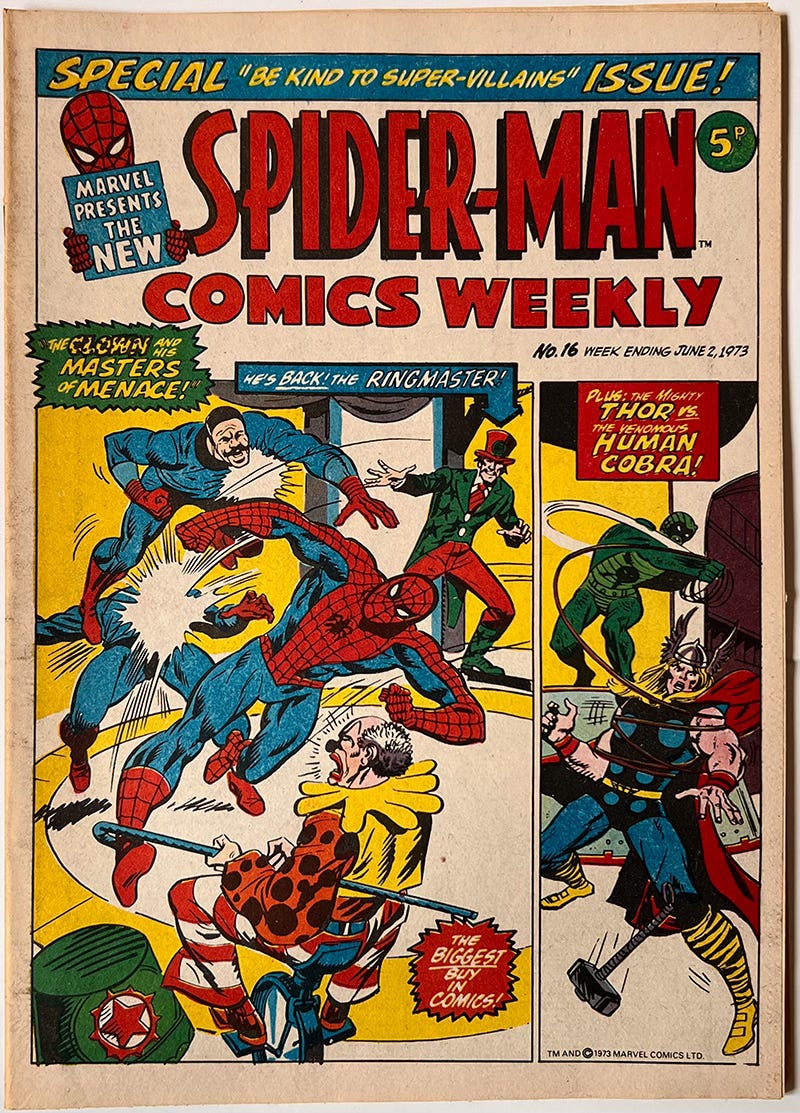
And last but not least…







I really think we need a photo of the shed, if you have one.
I was getting Valiant & SMASH! when M.W.O.M. and Spider-Man first came out I think. M.W.O.M. and Spidey were a whole 2p more expensive, which my Mum and Dad had conniptions about. Agree about Ditko's art in the 'raw'. I loved seeing how Kirby's style developed from his early FF stories onwards – some of those images (seen first in two-tone UK reprints) are lodged in my memory forever, iconic as Mount Rushmore!