Judge Dredd & The Man from U.N.C.L.E.
Mega-Specials, Shattered Glass and Metallic Covers
In the Summer of 1988, Richard Burton, the editor of 2000 AD asked me if I would be interested in designing a new title called the Judge Dredd Mega-Special. Well, I had no hesitation in saying yes, so with that in mind he asked me to think about how I wanted to design the cover. It had to look different from the regular 2000 AD, but also in keeping with the style of the weekly comic. Although a version of my logo design was on the cover of the regular progs, and I was designing interior pages for the weekly, the in-house Fleetway art department still had control of the cover design and typography. This unfortunately meant that the design philosophy was pretty inconsistent, and Letraset typefaces like 'Dynamo Shadow' would occasionally rear their head, depending on who took the reins that particular week.
Apart from the odd cover here and there, I didn't really get control of the type mark-ups and layout until Prog 700 where, with a much larger budget we really went to town with a fabulous cover by Sean Phillips, and for the first time the use of a metallic gold fifth colour to further enhance his artwork. 2000 AD was regularly printed in CMYK (Cyan, Magenta, Yellow and Black). But a fifth colour can refer to any choice of an additional fluorescent/neon or metallic spot colour.
The elements that were to print gold had been supplied on a separate layer above the artwork and with a bit of a collaboration with Sarah Colley in the production department, we marked those up for our chosen metallic ink.
Prog 700 was scheduled to have a rather large cover mounted free gift, so this was taken into consideration with both artwork and cover lines, leaving a free area bottom left. From this point on I tried to keep the type styles consistent, using a typesetting house called Salden Graphics who were really open to experimentation and had access to some pretty unusual fonts.

Even though I was still a freelancer, I was given more regular assignments by the editorial department AKA, Tharg! This also gave me the opportunity to to fix something that had bugged me for months, and that was the chance to redraw the 2000 AD logo, to how I’d originally intended it. The version featured on prog 700 was the one that the Fleetway art department had drawn up from my very rough design scamp, before I’d had a chance to perfect it. You can see how much thinner that version is compared to my updated artwork and its first use on prog 750 below. Incidentally, the iconic Judge Dredd logo that I incorporated was originally created by 2000 AD’s original Art Editor Jan Shepheard, though for some reason I’d always thought it was Kevin O'Neill. There’s a great article about Jan on John Freeman’s Down the Tubes site on this link: ‘In Memoriam: Jan Shepheard, 2000AD’s first Art Editor – an “unsung heroine” of British Comics’.
As well as the first appearance of the updated logo, prog 750 was also given a larger budget and the opportunity to enhance the cover with a fifth colour again, this time using silver. This one was even trickier to achieve because of the way it blended in with the art, but again with Sarah Colley’s production help it made Kev Walker’s amazing A.B.C. Warriors cover even more spectacular.
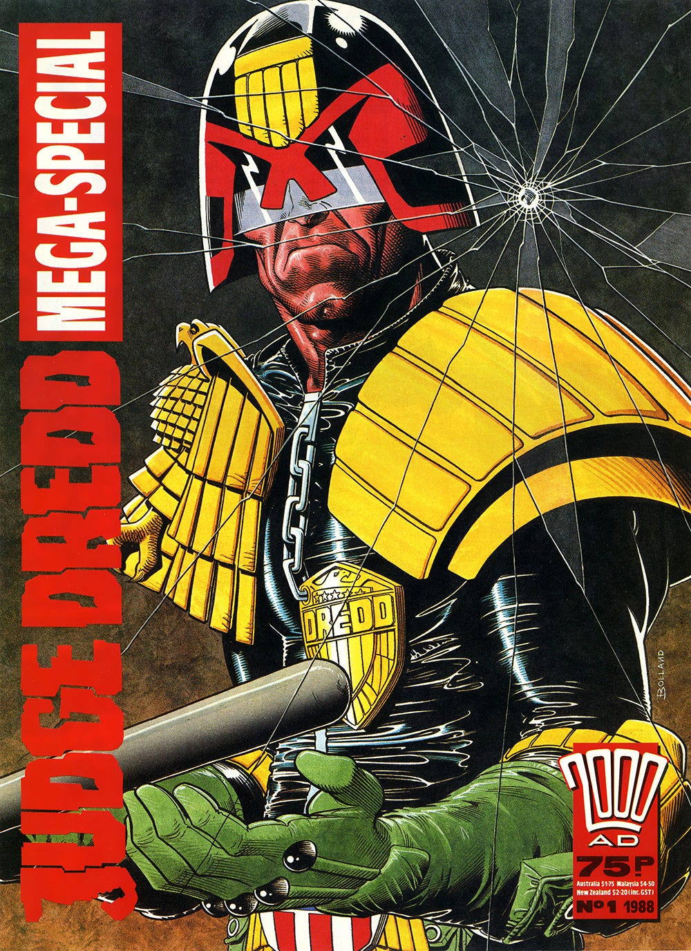
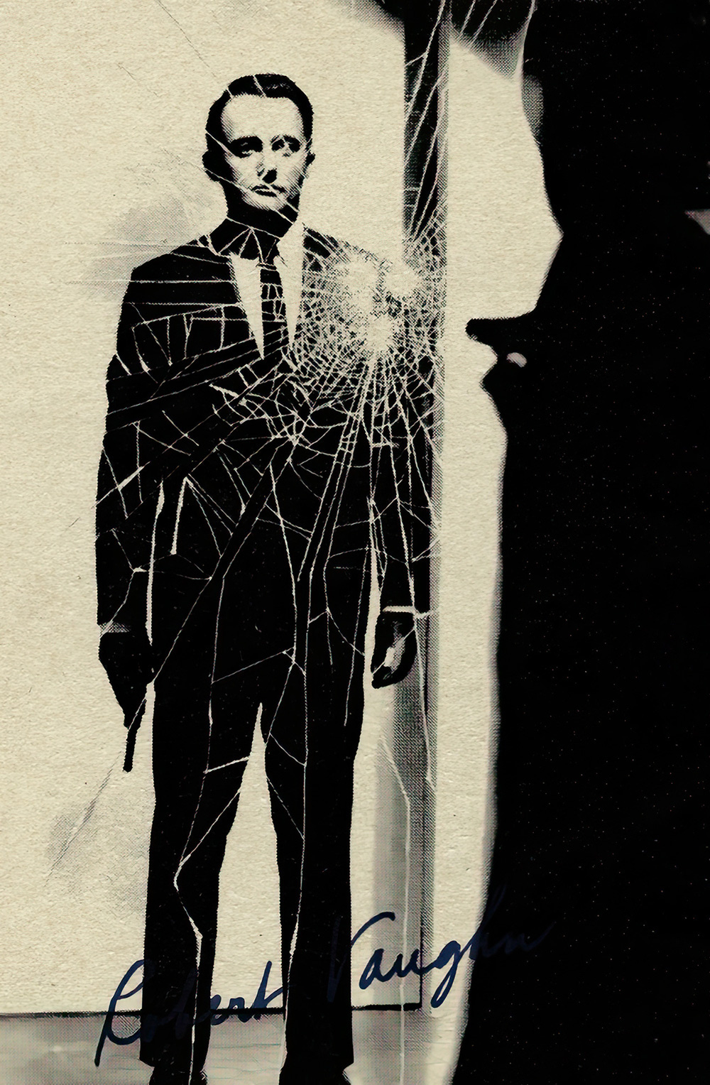
Meanwhile, back to the Judge Dredd Mega-Special… I’d decided to run the logo vertically alongside the spine, giving the illusion of more space for the artwork. As an idea for the theme of the cover, there was a scene in the title sequence of The Man from U.N.C.L.E. that I'd always liked, being a child of the 1960s. During this intro, Napoleon Solo is shot at by an intruder in U.N.C.L.E.’s underground complex. He is however, standing behind bullet-proof glass which takes the impact and cracks without actually shattering. Alan McKenzie, who was also freelancing for 2000 AD at the time, had a set of U.N.C.L.E. bubblegum cards, and one of them featured that very scene, so he kindly lent it to me. I Made an enlargement on the PMT (photo mechanical transfer) machine and alongside that, knocked up a very quick pencil rough to show Richard Burton. Luckily, he went for the idea and then to my horror, suggested that Brian Bolland might be up for illustrating the cover.
Now, when I say 'horror', it's not because I didn't want to see a cover by Brian Bolland on the special, because he’s one of my favourite artists, but the thought of Richard sending him my crappy sketch was totally f@%?*!g embarrassing, and I started to wish I'd spent more time on it. I now know that the more sparse the cover rough, the better it is for the artist, because they can feel free to put their own spin on the idea, unless of course the brief is particularly specific. Anyway, when Brian's package arrived in the office we were all totally blown away by his artwork when we opened it, and if I remember correctly, this was the first time he'd drawn Judge Dredd in quite some time.
Here’s the (now rather ancient) opening scene for The Man from U.N.C.L.E. that I referenced.


Man, I've never seen the original The Man From U.N.C.L.E and now I must. That opening sequence looks like Jim Steranko artwork come to life!
I remember the surprise of seeing that cover on the newsagent shelf, a couple of years after Bolland had sworn off drawing Dredd (that last panel in prog 500 seemed pretty final).