I thought I’d share a few of the ads that I was asked to design and illustrate for 2000 AD’s weekly publication back in the late eighties and early nineties.
Because of the relentless deadlines associated with the weekly nature of the comic, we would quite often find ourselves with a blank space where a paid advertisement was supposed to go, but hadn't been supplied in time. With this in mind I was asked to make a few 'filler' ads.
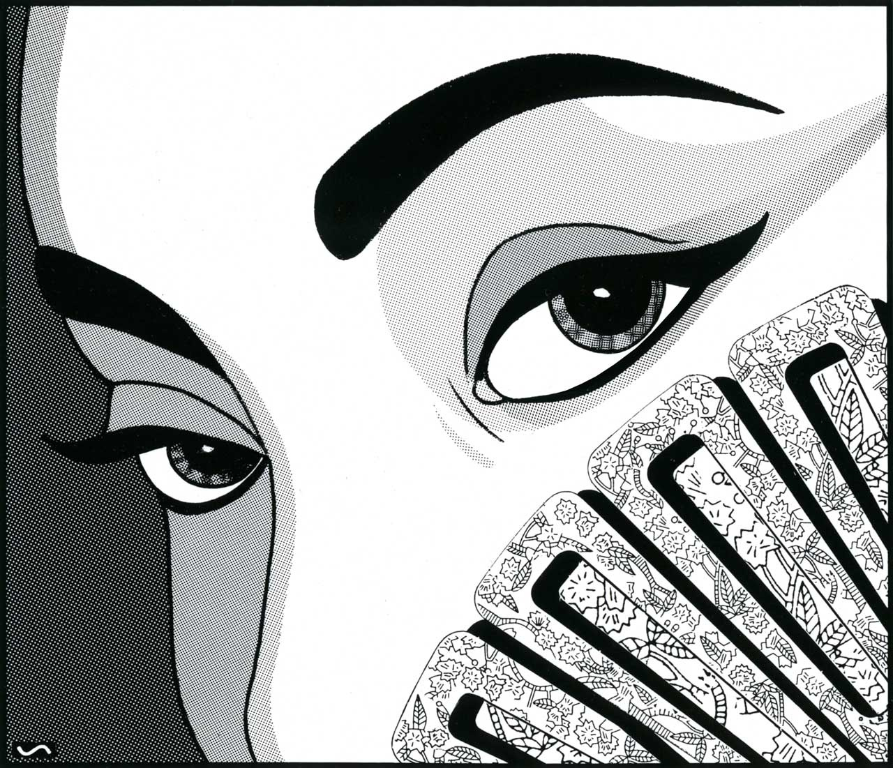
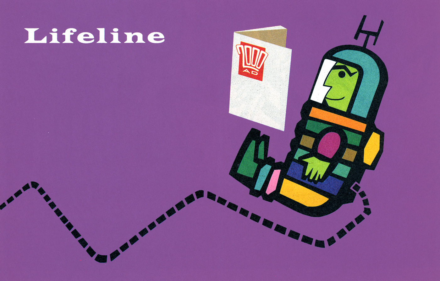
For one particular ad, I disguised the 2000 AD logo as a handheld fan. The face itself was based on my rather glamorous landlady, Breeze, who was a singer and model at the time.
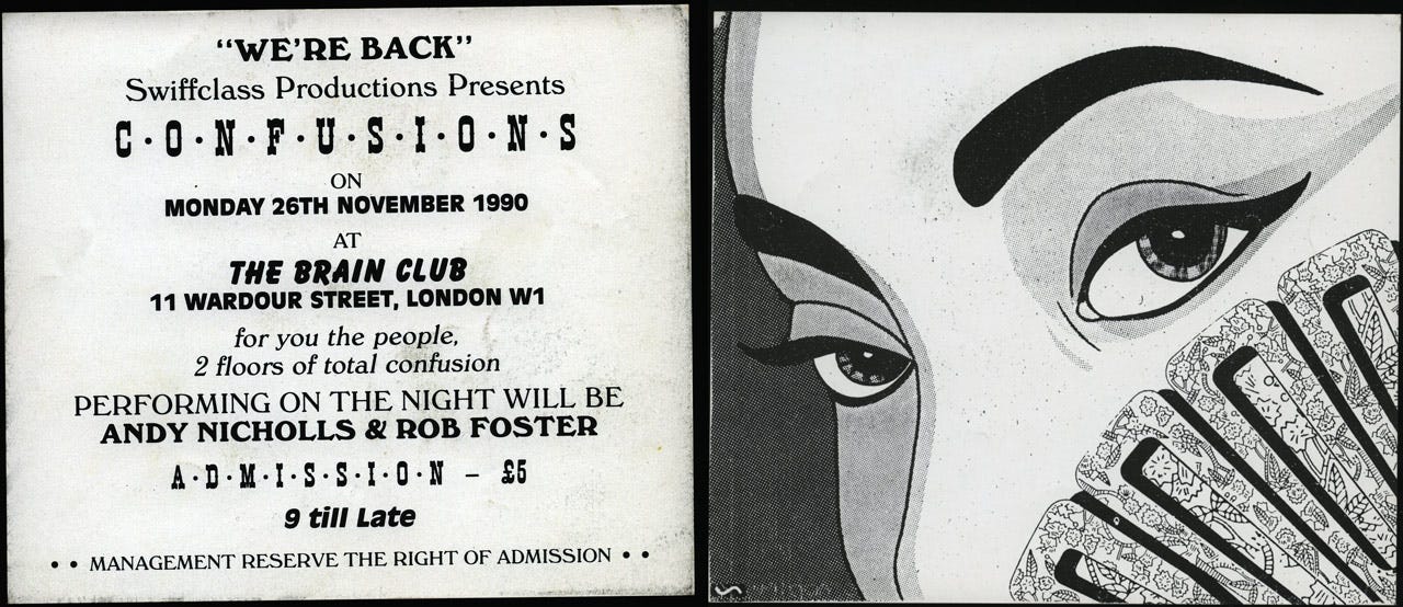
A few days after this had been printed in the comic, I was strolling through Chinatown in London's West End and was surprised to see hundreds of flyers with this very same image, blowing around in the breeze (no pun intended). I picked one of them up and flipped it over to see that it was a flyer advertising The Brain nightclub. I marched up the road to the address on the back and asked to see the manager to inquire why they were using my illustration. "Nah, mate, that's one of Barnzley's" he said, "We paid him for that flyer". "If that's the case, then why on earth did he use my signature too?", I asked. (At the time I used the 'S' from the logo I'd designed for Starburst magazine to sign my work). Anyway, I wasn't that bothered and kind of flattered that they'd liked it enough to use it, to be honest; plus they let me into the club for free a few times to make up for it.
One thing led to another and a couple of years later, The Brain became a bit of a regular haunt for Rian Hughes and myself. It was only three doors away from a studio we shared in Chinatown and a good place to hang out and drink rather elaborate cocktails. I finally met Barnzley himself when I was shooting the stills for William Orbit's, Strange Cargo III music video. He was the stylist on the shoot and turned out to be quite a comics aficionado, and quite a character too (to say the least!).
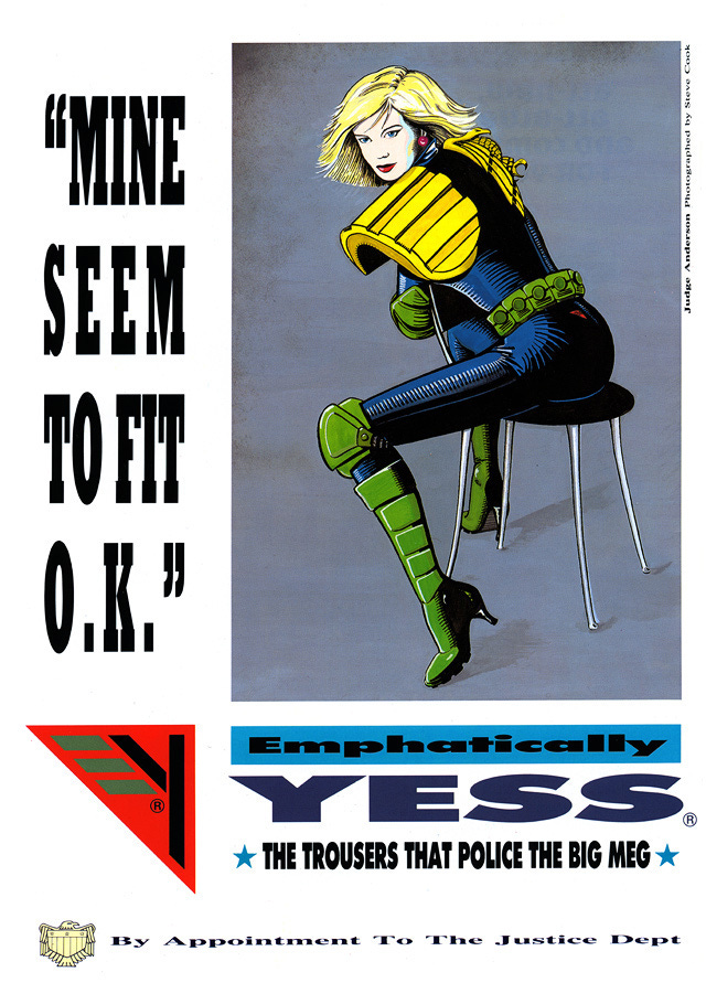
Emphatically Yess
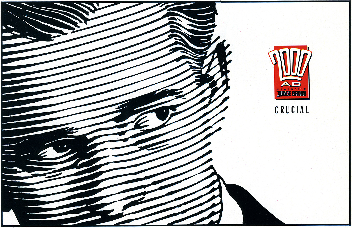
Here's a back page ad that I did for 2000 AD sometime in '89. I initially did the painting for a bit of practice really. I wanted to imagine that I'd photographed Judge Anderson in a studio setting. As it turned out there was an empty back page to fill on the comic one week, so Alan McKenzie came up with the idea of using it as part of an imaginary ad for the Justice Dept. He wrote the copy, I did the design & paste-up, and it went to press.
The thing that bugs me about it now was something that John Higgins drew to my attention. The chair legs were a bit too spindly to give the chair any weight. I could see what he meant immediately, even though they were based on the metal legs of a real chair, I might not have been quite so literal and should have beefed them up a bit. Unfortunately it was already in print, but I always appreciated his comments because it's often tricky to look at things objectively, and constructive criticism is what makes us better. With this flaw in mind I wasn't going to bother scanning it, but by chance, I spotted a mention here on a Judge Dredd review site, by someone who seemed to like it regardless. So what the heck, here it is, in the days when pre-computer stretched type was all the rage, a la Neville Brody.
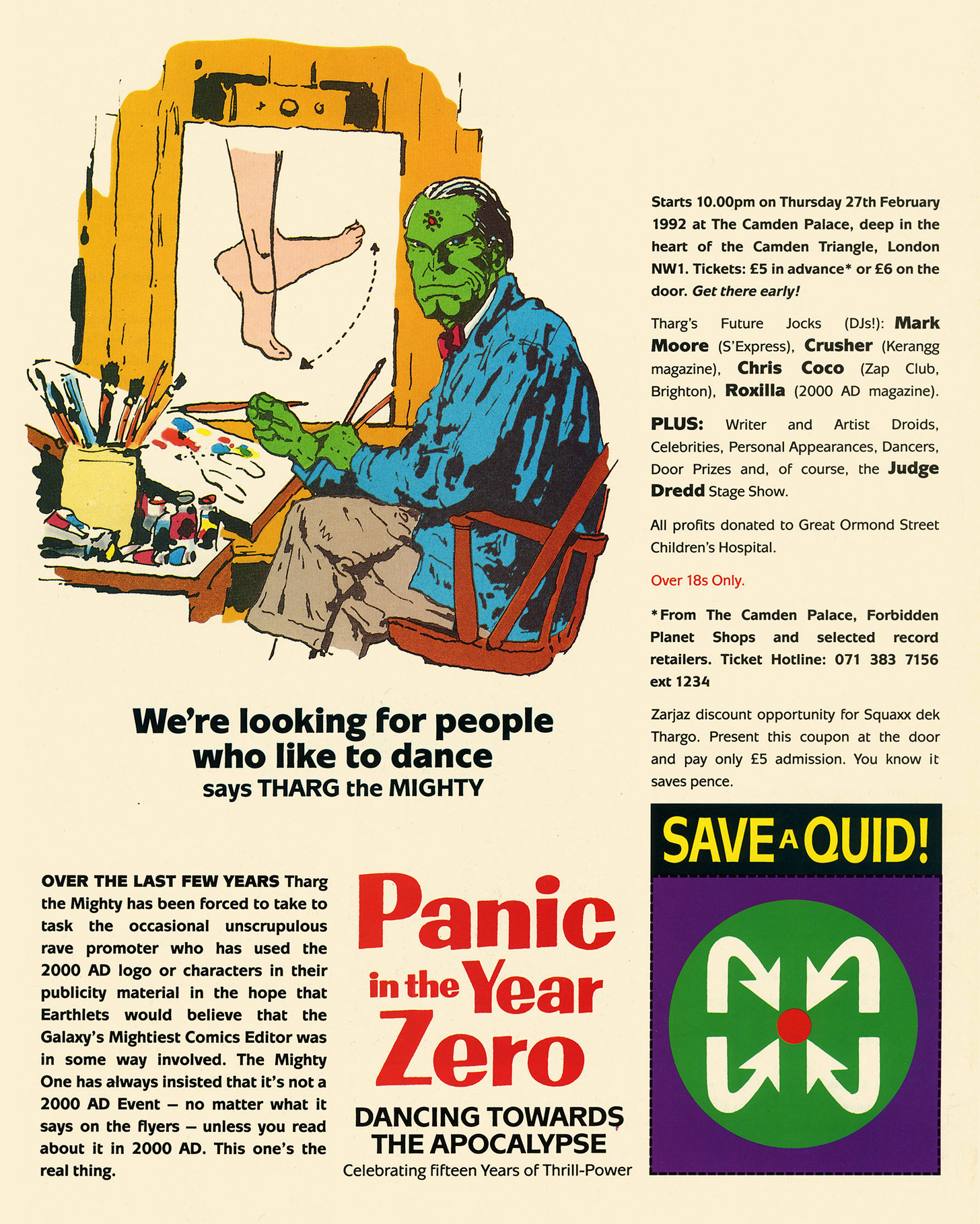
Dancing Towards the Apocalypse
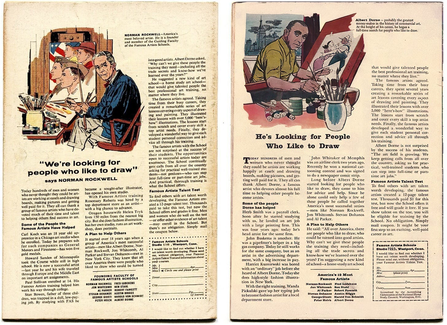
I had a lot of fun with this one. Throughout my childhood I’d seen the Norman Rockwell ads on the back of the majority of my American comics, so I thought I’d draw an updated version for the back page of 2000 AD, replacing Rockwell with Tharg the Mighty. This was an advertisement for our celebration of 15 years of Thrill-Power at The Camden Palace in 1992.
Above: When the typesetting arrived by courier, and the tracking was all over the place (above right), there wasn’t generally time to get it reset. Below: The source material!
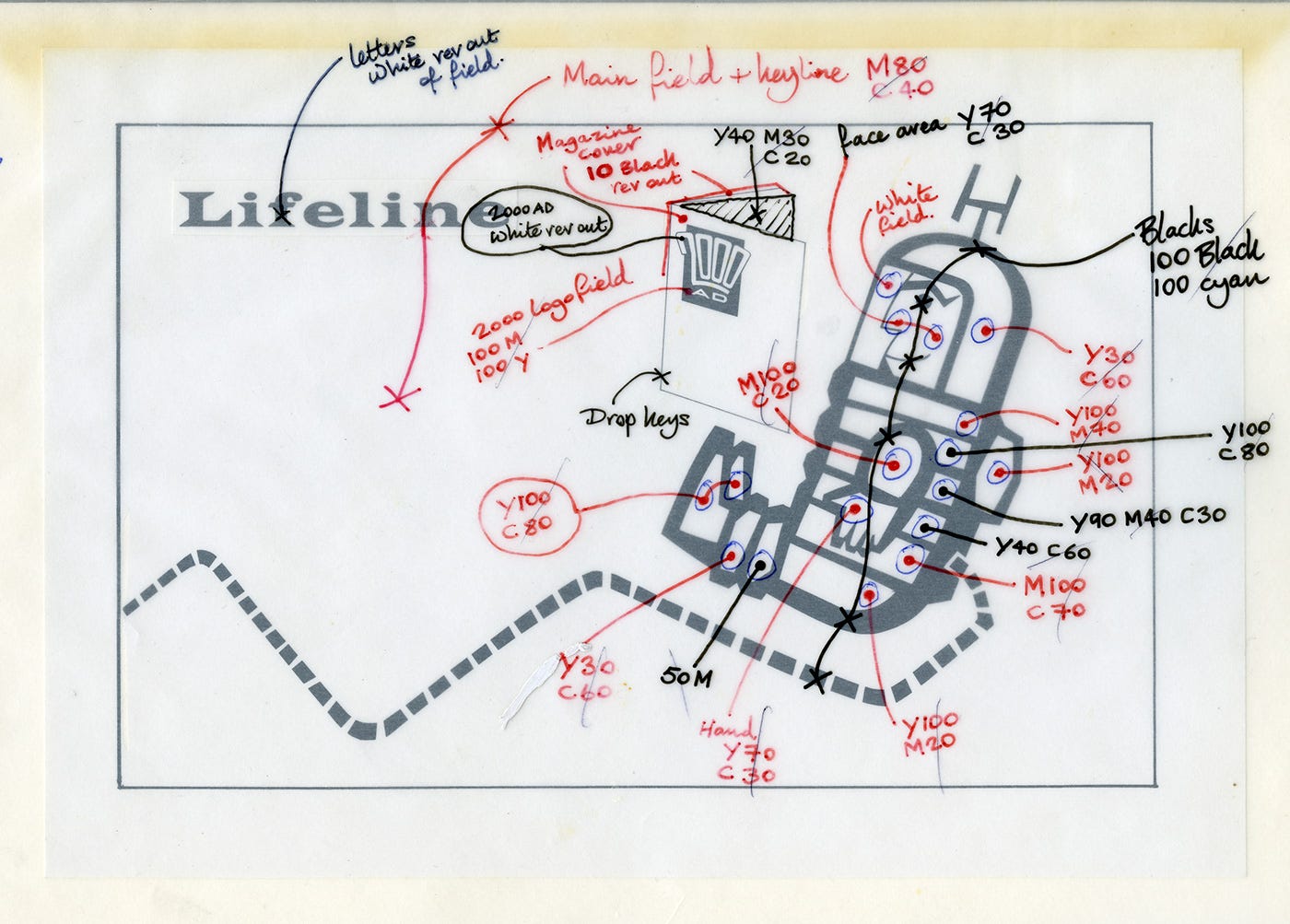
Colour Mark-Ups
It seems like ancient history now, but before the advent of Desktop publishing, designers had to imagine what the colours would be in our mind’s eye, with a bit of help from a colour index book. We’d then mark the line art up with an overlay of CMYK instructions, and hope for the best when the proof arrived from the repro house.
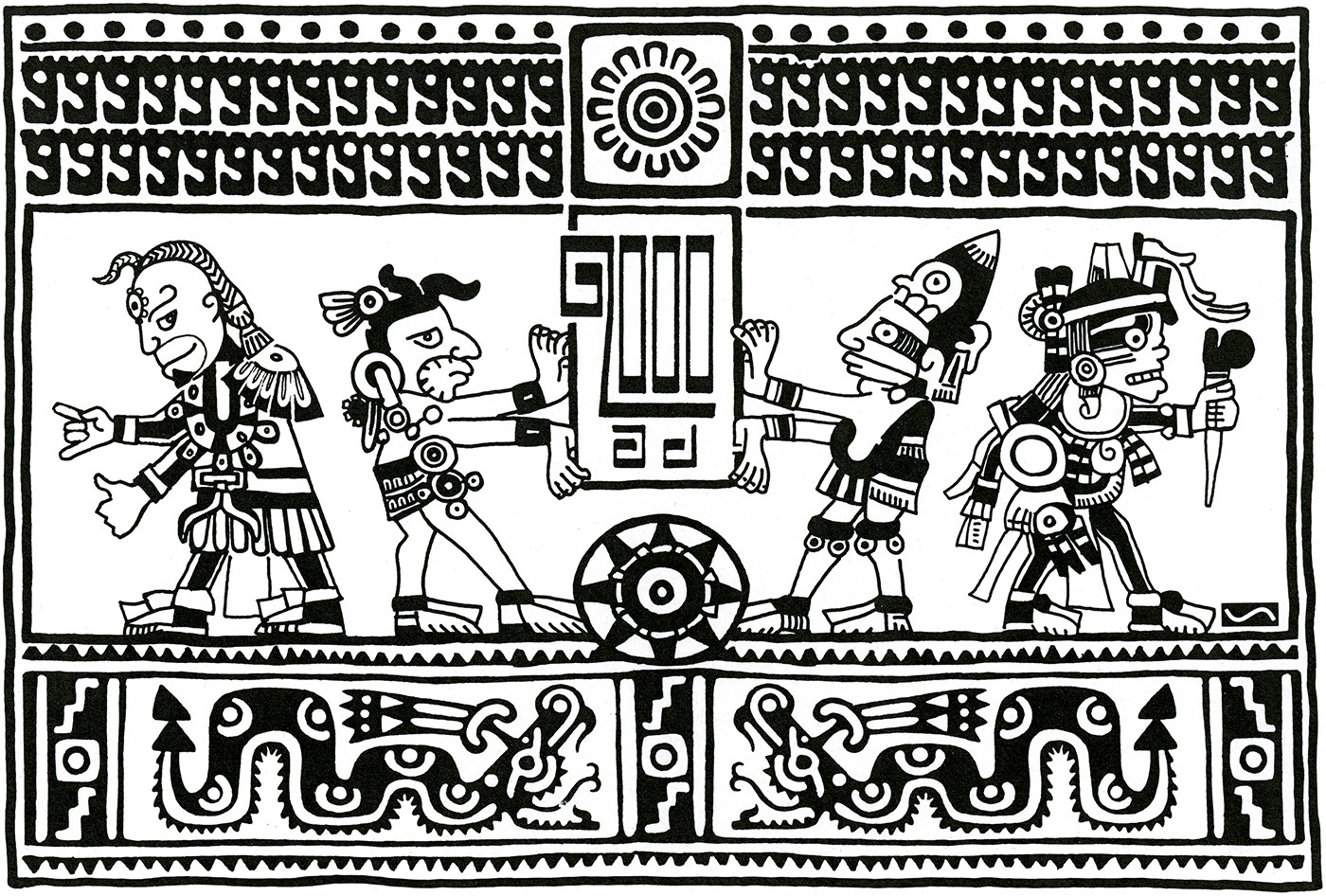
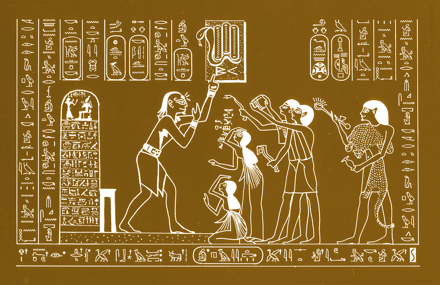
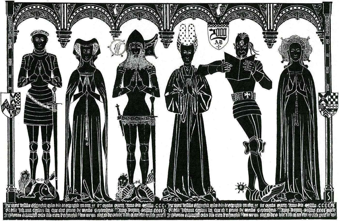
Below are three illustrations from my rather bonkers 2000 AD throughout history series. Spot the Tharg’s!
These next two ads were pretty corny, but they were made with speed and achieved their purpose of avoiding blank advertisement spaces. Plus they gave me a bit of a deadline challenge.
Back page ad: 2000 AD 1157
A few years down the line I could take advantage of digital technology and things got far more interesting. Using a combination of photography, styling, typography and illustration, my outcomes became far more elaborate.


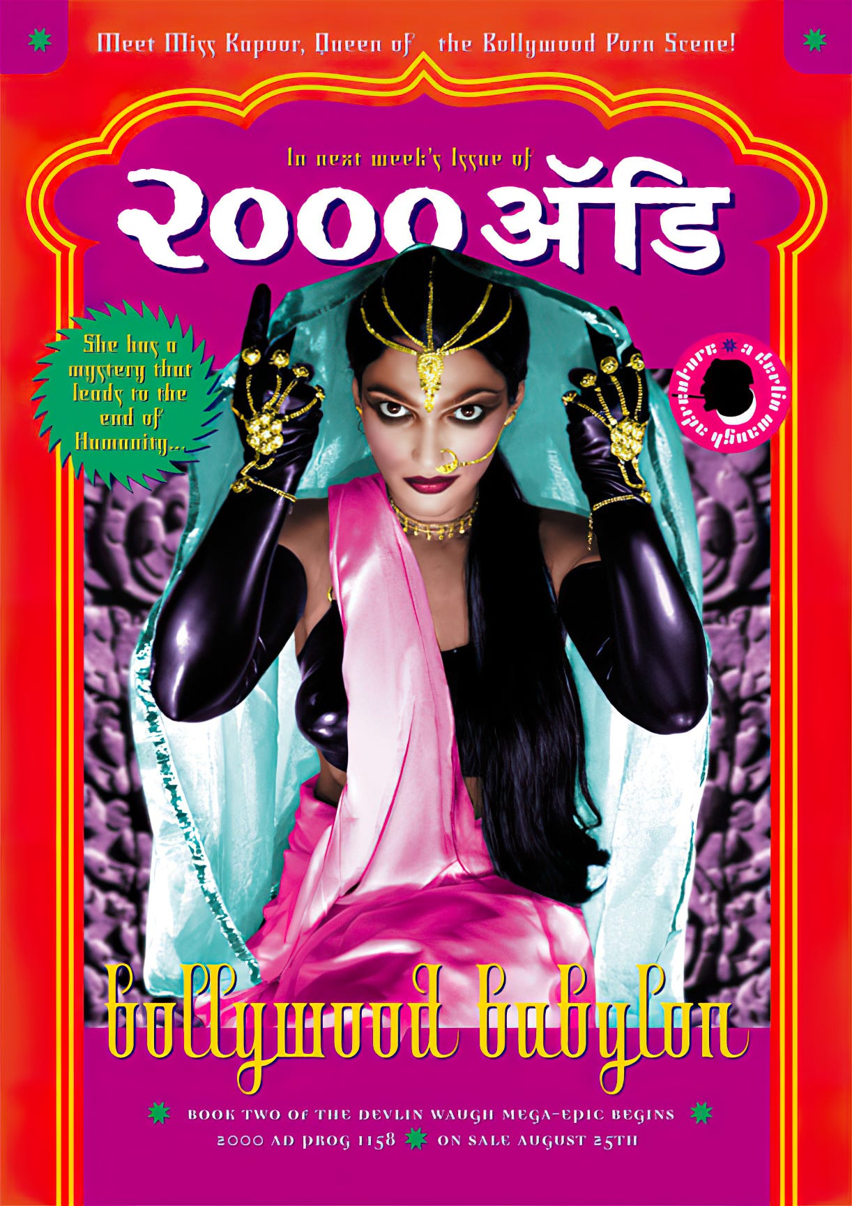
I started reading around Prog 614, jumping across from the US Quality Comics reprints (being in rural Western Australia, you pretty much took what you could get) and these ads, along with stuff like Roxilla's record reviews and John Brosnan's movie reviews, really helped me get my head around the culture of 2000 AD, and I guess London at the time as well. Invaluable stuff.
Loved these ads back in the day, thanks for sharing. I also went to the 'Panic in the Year Zero' 15th birthday party, what a hoot that was!
...and you've met William Orbit! (big fan of the Strange Cargo albums) 👍